3 THINGS : food photography editing tips | with before & after pics

let me just start this post by saying that i don't have any education in photography. i'm not an expert at this at all, i'm just self-taught. and i'm not saying that my way of editing photos is the best way, or even a particularly great way ^^i do like the way my photos look though. they are my style. sometimes i can't manage to get them exactly where i want them, but when i do i'm always thrilled.and you guys have been asking me to write about this for a long time, so i hope that you get something out of this post.below are some pics with half the original photo kept unedited, and the other half with my filter.i only use natural light, and my camera equipment isn't fancy or expensive. i also move around a lot, making it difficult to find spots that i know will always have good light, especially in winter. this means that i have to work harder in the editing room to get the effect i'm after. good news is that there's so much you can do to a half-crappy original to make it look half-decent when edited ! when it comes to running a blog, i'm of the opinion that the visual element is probably the most important one to attract readers and keep them coming back. my recipes could be the best in the world, but without trying to make my food look delicious in photos, i'd have a hard time getting people interested. it's all about inspiring and telling a story, through food photography.and you guys have been asking me to write about this for a long time, so i hope that you get something out of this post.below are some pics with half the original photo kept unedited, and the other half with my filter. as you can see, i like adding a milky blueish tint to my photos, upping the brightness a bit and making colours pop. that's just my aesthetic, and it changes somewhat over time too of course.i edit my photos in photoshop CS6 mostly, but i reckon most editing programs have similar features ( at least the ones i've tried ).
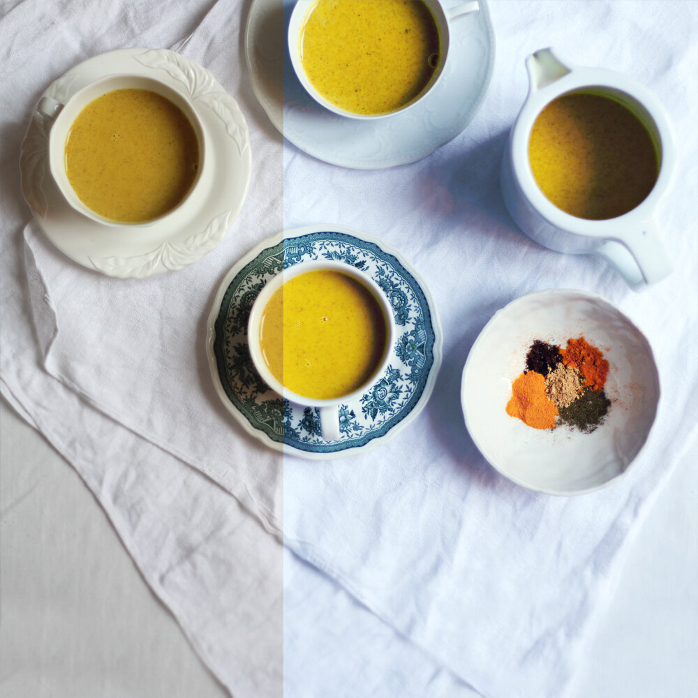 so if you're interested in food photography or maybe starting a food blog - here are the, in my opinion, top 3 most useful editing tools !curvesnow if you're new to this, my recommendation would be to first and foremost decide on your style. this can change over time, but it's good to have a first idea to work from. my style for example is crisp, blueish, magic hour ( dusk and dawn light ) bright, with strong colours, and most often a light minimal background. you might be into dark musty greens and golds, or faded muted pinks and nudes.if you don't know just exactly what your style is yet, go roam through different types of food blogs and find out !ok, so now that we know what we are after - curves is step one in achieving that goal. this tool might be called something else in your editing program, but basically it's where i modify the light, brightness, contrast.looking at the before and after photos below, we can see how much brighter the whites are, and how much overall lighter the photos are. i also make the darkest blacks a little bit softer, and up the contrast by making dark colours darker. so when i'm done, the straight line in the curve tool now has a snake shape, if that makes sense.we can also modify the colours in the curves tool, but i use another tool for that ( when editing our videos, i use curves to modify colour). more about that later.
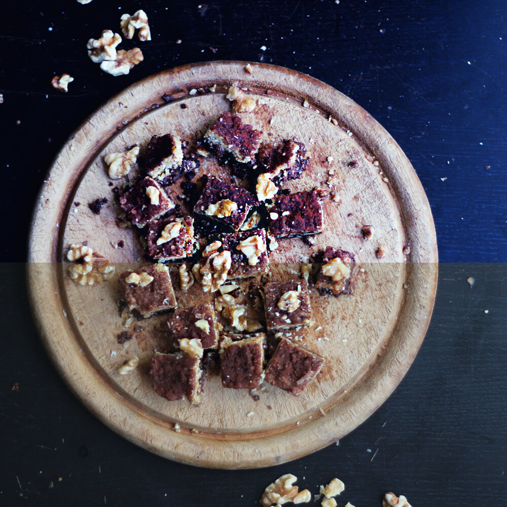 solid colournow that i have a curve that makes my pics look good light-wise, it's time to get some atmosphere. to get that early morning pale blue light feel. for this, i use the solid colour tool. basically all this is a layer of a colour of your choice, laid right over your photo. then by changing the opacity and blending mode of that layer, we'll get the atmosphere we're after.i usually add two layers of solid colour. one dark blue, slightly going towards purple - and one light blue moving towards turquoise. for the dark blue layer i usually use the overlay blending mode, and it will make my black shadows turn blue and my whites appear like they're seen in very pale blue cloudy light, instead of for example bright yellow mid-day sunlight. at least that's what i think !with the light turquoise layer i usually change the blending mode to soft light. this will sort of diffuse the image, like i'm shining a soft, muted greyish turquoise light on the image, softening the shadows, making the whole pic lighter, and keeping the colour very cold and pale.if you look at the image below, you'll see how much colder the whites are, and how blue the shadows are. i feel like adding blues this way make the whites seem whiter, crisper.if we instead look at the image above, we can see that the black table has turned blue.if we hadn't had the originals to compare with, we would just see the table as more or less black, and the mortar and pestle as white, but in comparison the blues are really prominent right ?using the same solid colours ( albeit modified to suit the picture ) for both dark black and light white coloured backgrounds make both types of images feel cohesive and like they belong together. so once again i just want to say how important i think it is to be clear with myself on what my aesthetics are, to create a look that's specific for my photography.
 colour balanceafter my curves and solid colour layers are in place ( and i've modified the curves again to suit the solid colours ), i touch up by changing the colour balance. now, this can be made in curves too as i mentioned above, but i use the colour balance tool. it's just what i'm used to i guess.with this tool, we can colour correct our highlights, midtones, and shadows. depending on what natural light i had when taking the photos, i might change the colour balance a lot or hardly at all. shooting on a cloudy day means that i have to change this way less than shooting in sunlight - simply because i prefer cold colours over warm yellows. so this all depends on the style your after once again.how i use this tool depends a lot on the colour of food. since i like to preserve colours in my pics, i don't want to mute or distort them too much.starting with highlights. on the cyan - red scale, i almost always go a bit towards cyan to make sure there are no red tones in my bright whites. sometimes that's all i do, sometimes i also go a bit blue on the yellow - blue scale.moving on to midtones. here i almost always slide the yellow - blue scale towards blue. i feel like food is almost always warmer, more yellow in the camera than what it looks like in reality. if this modification has made the image look too purple, i go a tiny bit towards green on the magenta - green scale.finally shadows. here i usually just slide the blue way up. i might occasionally go a bit cyan here too, if the shadows look a bit warm. i feel like changing black shadows to the colour of your choice is one of the most instantly effective ways to create some poetry in your photos.
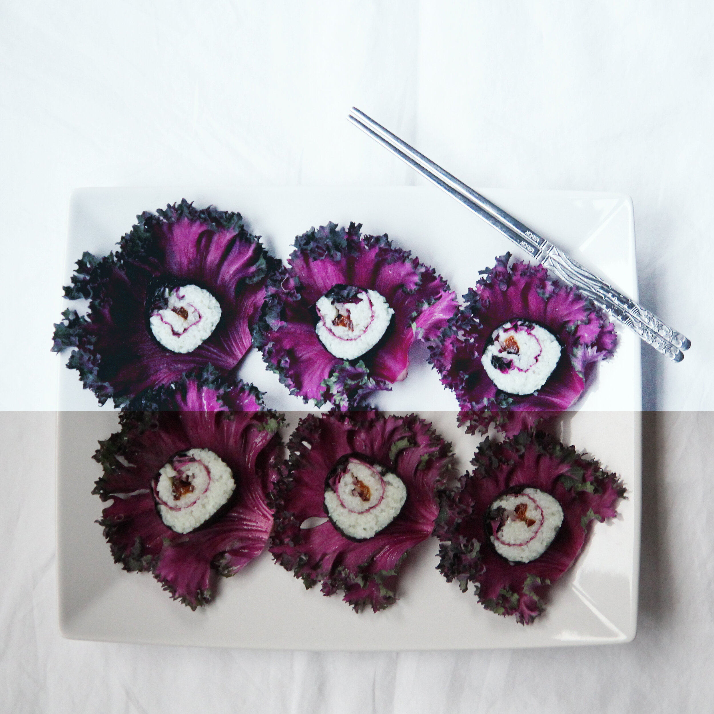 and that's it. those 3 are usually the only layers i add when editing food photos. then i might go in and do some tiny detail enhancement - like saturating some colours on a garnish, or blurring the towel the plate is one etc, but that's just icing on the cake.i hope you found this post helpful or interesting. if you're into food photography, please share your favourite tools, tricks, and tips in the comments !if you'd like, i'd be more than happy to make similar post on how i do food styling, and how me and david edit our recipe videos. let me know if you'd like that and i'll get on it asap.love // jenny___p.s. make sure to never miss a post – follow me on bloglovin’ !laptop above is a zenbook UX305LA. we needed a new work laptop and our friends at asus really came through, so a big thank you for being our sponsor you guys !it's light but powerful, and it's handy that it's completely syncable to your iphone/icloud etc.so pretty too ^^